The identity was centered around a modern logotype, inspired by the iconic mailbox symbol. It inspired a fresh new color palette with more intense blues and neon accents, abstract patterns and a layering treatment.
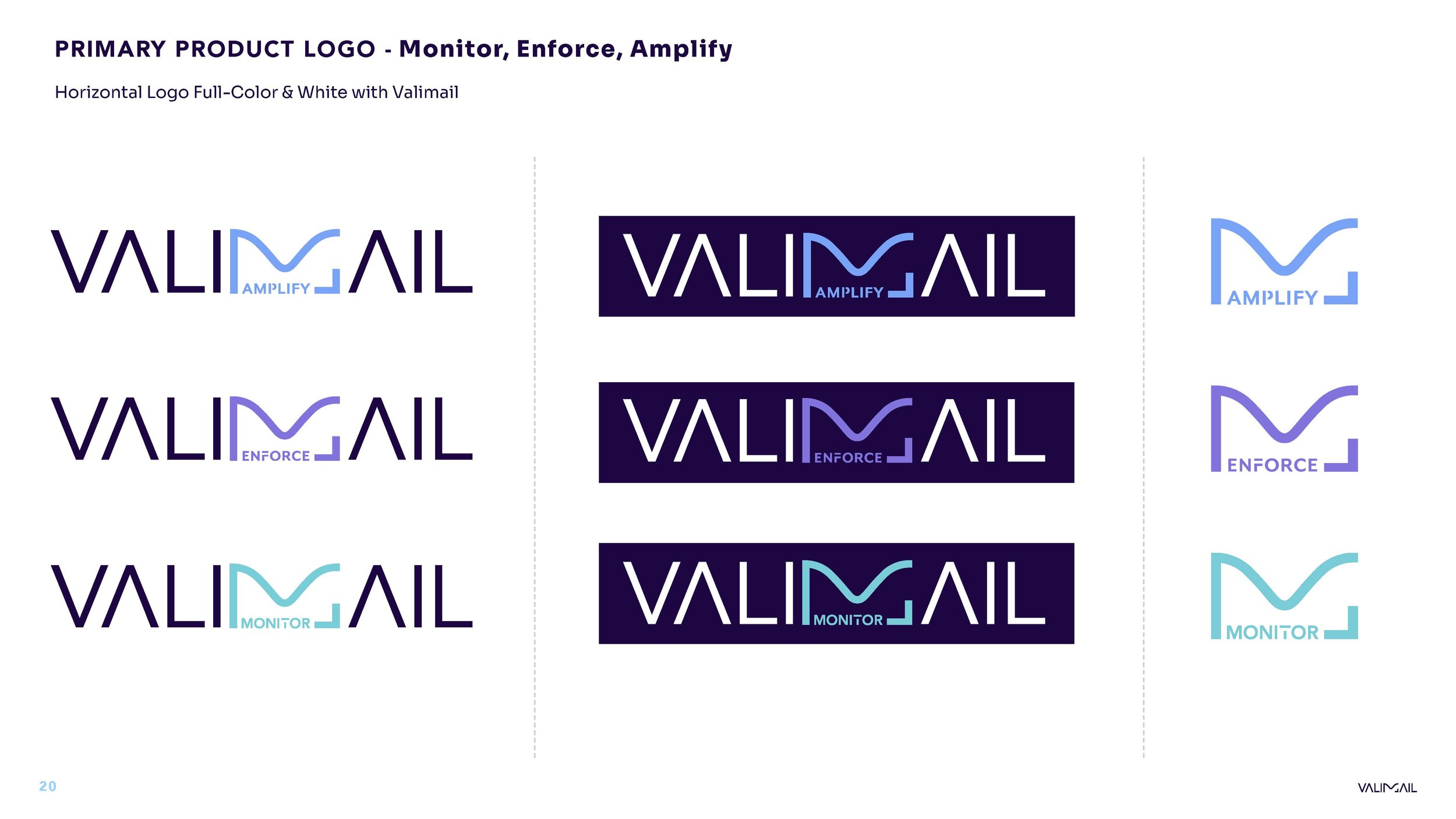
The logo also inspired how we show the products. Before the re-design, products weren’t tied to the brand identity and logos didn’t visually hint at product capabilities. We accomplished both of that.
The experience was brought to life across ads, social, video, website, in person events. The brand finally had the tools and assets to visually explain the technology, instead of just saying it.
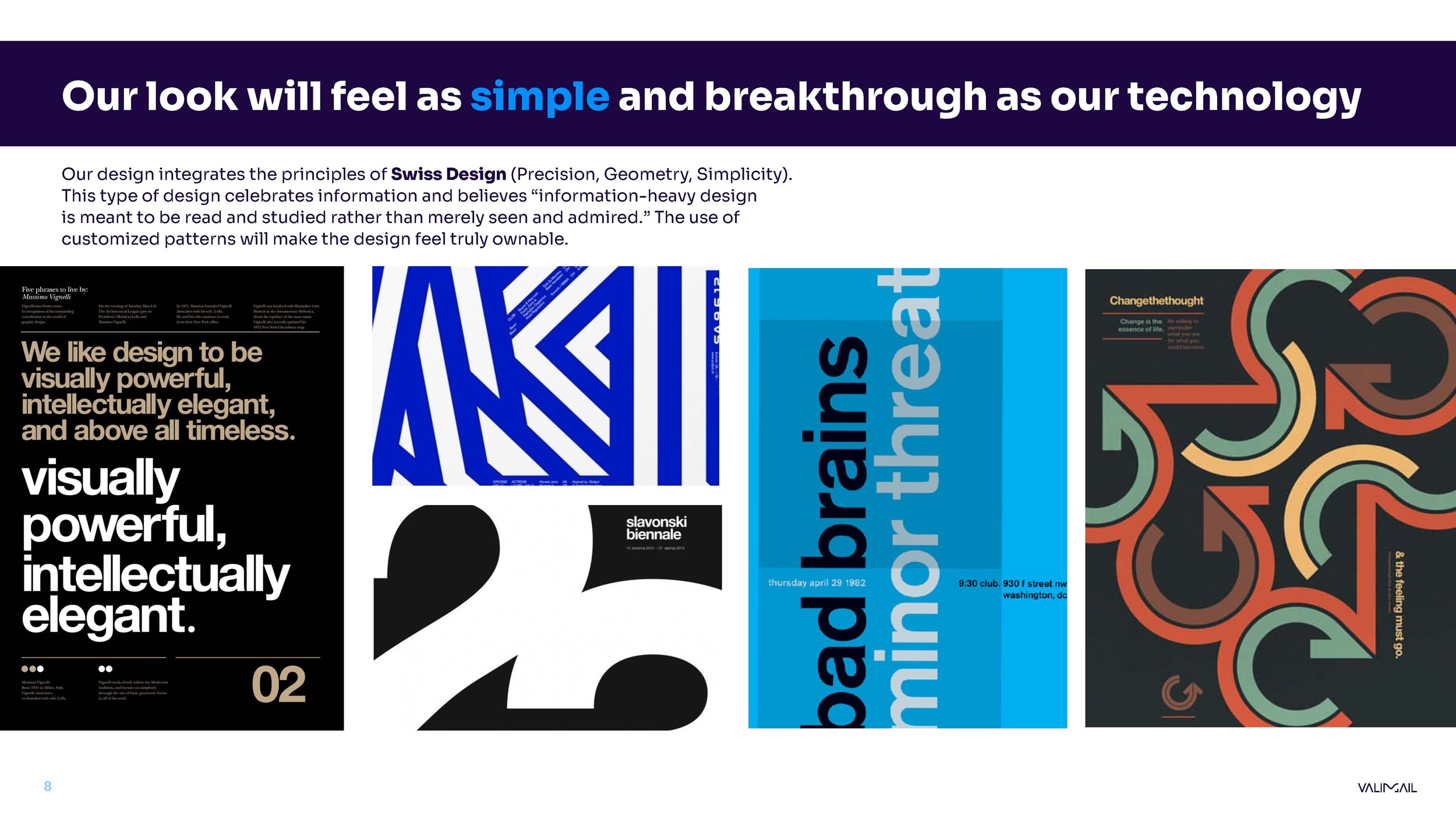
The previous visual identity revolved around fonts with no personality and felt very corporate. We found fonts the paid tribute to our technology routes - like Sora. This sans serif font was developed with technology in mind and takes inspiration from early screen typography. We paired it with a visually consistent font like Avenir which geometric routes and aids with readability. We knew we needed fonts that could aid in delivering more long-form creative pieces.
We are in the business of protecting your identity, so photography should express that.